

Boardspan Mobile Redesign
Boardspan is a SaaS business that helps boards of directors succeed through online tools and services. I have been employed at Boardspan since 2019, first as an Associate Product Manager from Feb, 2019 to Sep, 2019 and as a Product Designer since Nov, 2019.
Role
- Problem Definition
- Market & User Research
- Concept Exploration, Ideation, & Low-Fidelity Wireframing
- High-Fidelity Designs & Prototyping
- Usability Testing & Validation
- Stakeholder Management
Duration
Apr - May, 2022
Product
Boardspan Mobile
Tools
InVision, Balsamiq, Figma, Zeplin
Overview
In my role as a Product Designer at Boardspan, I have had the opportunity to work on numerous products that have been used by a variety of clients, such as Twitter, Farfetch, and The United States Olympic & Paralympic Committee. It has been an incredibly rewarding experience to design products that have helped shaped the way these boards support and grow their organizations.
This case study highlights a recent project where I was tasked with improving the user experience of their mobile application. The project was very successful, with resounding support from the entire company
The Challenge
The original use case for the Boardspan mobile application was a market dashboard whereby a user could review company data on their way to a meeting. As the application grew, the use case shifted to be a complete extension of the Boardspan web application. With these additions, the primary use case had become the same as the web application: to efficiently complete any outstanding tasks.
The navigation of the mobile application had not been updated to reflect this change in use, nor did it align with the navigation of the updated web application. These differences could create significant challenges for the user.
The Problem Statement
How might we reduce cognitive strain, reduce inefficient navigation, and improve the user experience when navigating the Boardspan mobile application?
Hypothesis
Updating the interface on the mobile application to more closely align with the web application’s task-oriented approach will reduce time spent inefficiently navigating the application and improve the overall user experience, allowing the user to rely on affordances provided by the web application’s interface.
Existing Product Analysis
To begin this project, I reviewed the existing mobile navigation and made notes of potential friction points in the user flow. I noted where the navigation or UI had been improved or changed on the Web application.
Additionally, I created a sitemap to better visualize the information and structural hierarchy of the navigation. This visualization helped me further identify variance between the web app’s navigation and the mobile app.
Market Research
As the use case had shifted to a task-oriented behavior, I decided to research how other task-based systems managed their mobile applications. In particular, I investigated the mobile applications of Jira, Asana, and Google Tasks. In addition, I investigated conceptual designs on Dribbble for additional inspiration.
While I found a number of improvements of note, my largest takeaways from my research were:
As the use case is task-oriented, make the outstanding tasks as conspicuous as possible. A master-list of all to-do’s cross platform, as seen on web, will be helpful.
An exact 1:1 duplication of the side-bar navigation used on the web application may not be appropriate, as the sidebar would hide the to-do’s. Worth investigating with users.
Make sure the user is blatantly aware of where in the application they are, since a user may have multiple boards (in Jira/Asana: Projects).
Ideation & Wireframing
Next, I set out to wireframe as many concepts and solutions as I could envision. Additionally, I had our APD assist me in the ideation phase so that we could consider every possible solution.
After several rounds of ideation, I decided on four concepts to evaluate, with one from our APD (Concept B):

Concept A

Option B
Option C

Option D
Concept Exploration 1
In order to test these wireframes, I conducted a series of interviews with members of the internal team. In total, we conducted five concurrent think-aloud interviews, whereby I showcased each wireframe and asked the participant to think aloud about their feelings, confusions, and impression of each concept.
During these interviews, I would conduct the interview while our APD supported me with notetaking. Once the interviews were concluded, we compiled the notes in InVision and the APD used affinity mapping to consolidate the notes.
Finally, I refined the list into actionable line items and led my stakeholders through the findings. Some of our most valuable findings of note included:
Platform-wide to-do lists were a resounding success
Progress bars on assessments were well-received
Concept C was the general favorite, however many were confused by the web-oriented board picker below the tasks.
Concept Exploration 2
After completing the first round of exploration, I felt as though I still had some questions about the best solution for more specific UI elements. In the second round, I worked independently and collected both qualitative and quantitative data from the internal team.

Concept E

Concept F

Concept G
The results of these interviews were highly actionable (i.e. Home Icon, G > E > F, etc.) and did not require affinity mapping or stakeholder buyin.
At this point, I was ready to begin designing the new navigation concept in Figma.
HiFi Mockups
In order to accurately test the usability of the new navigation, I created a highly functional prototype. In addition, I created a simple version of the existing mobile application and its navigation that could be used as the control if the participant was unfamiliar with the existing navigation.

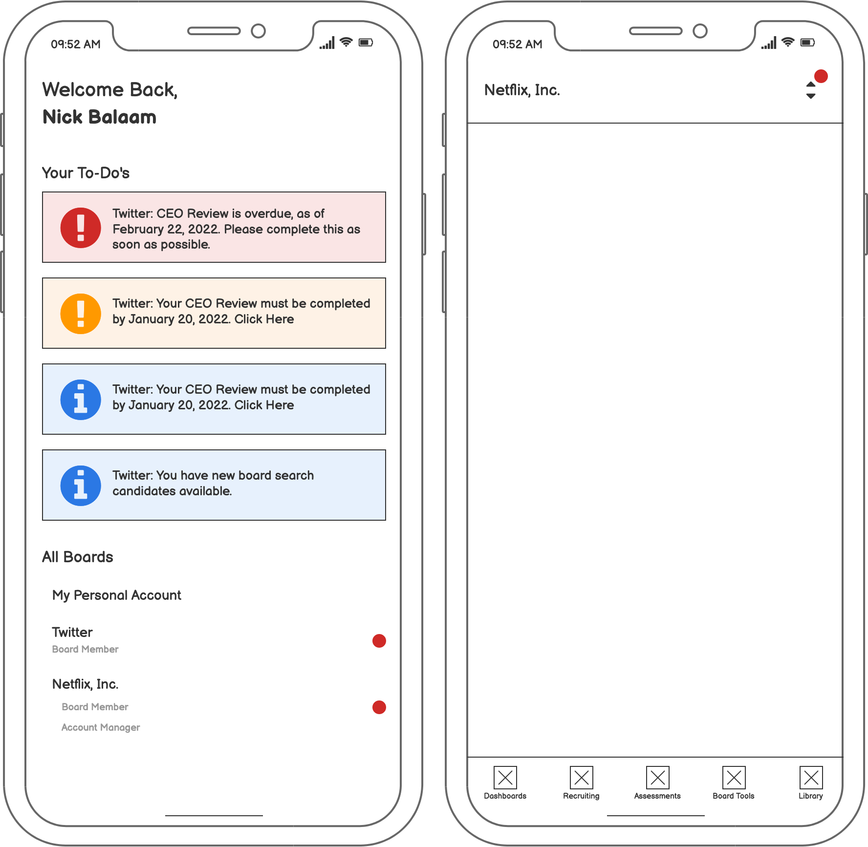
Welcome Screen & Board Picker

Assessments Screen

Take Assessment

To-Do Empty State
Usability
I conducted a within-subjects A/B test whereby each participant was asked to complete the same task on both versions -- the control (existing product) and the variable (new design). The results were very strong, with all five users strongly preferring the new design. In addition, all five users commended the intuitiveness of the new UI compared to the old design.
Finally, although anecdotal, I noted that each interaction with the new design felt more assured - a strong indication for intuitive design improvements.
The final step of the project was to communicate with the stakeholders, elaborate on the results of the usability test, and hand off the screens to the Product Manager for ticketing.
Final Thoughts & Future Changes
The changes to the mobile navigation significantly improved the usability of the mobile app. Further analytics should be utilized to better quantify the improvements (e.g. Time to locate data, user satisfaction, etc.).
I believe this project would have also benefited from unmoderated user testing, however I was required to conduct all user testing internally per the Head of Product.
In the future, I would hope to see a number of improvements to the application based on learnings from this project, including:
Improved push notification trigger updates and timings
Mobile assessment interface improvements
Better upselling funnels via marketing screens